Image
The Image component can be used to display local or remote images. It also includes support built-in support for image fallback, caching, and progressive loading.
Import#
import { Image } from "pearl-ui";Usage#
// Displaying a local image<Image  width={200}  height={200}  source={require("<path-to-local-image>.jpeg")}/>
// Displaying an image from a remote source<Image width={200} height={200} source={{ uri: "https://wallpaperaccess.com/full/1713248.jpg", }}/>Aspect Ratio#
In some cases, you might need to maintain the aspect ratio of an image to prevent cropping. You can easily do this by using the aspectRatio style prop.
// Maintains aspect ratio for an image having fixed width<Image  width={200}  aspectRatio={4/3}  source={require("<path-to-local-image>.jpeg")}/>
// Maintains aspect ratio for an image having relative width<Image width="70%" aspectRatio={16/9} source={{ uri: "https://wallpaperaccess.com/full/1713248.jpg", }}/>Caching#
If your application deals with a lot of heavy images, it's a wise decision to cache these images locally to make them load faster. Image let's you cache your remote images easily with the help of the isCached prop. By default, this value is set to true.
// The image is cached by default<Image  width={100}  height={100}  source={{    uri: "https://wallpaperaccess.com/full/1713248.jpg",  }}/>
// Don't cache a particular image<Image width={100} height={100} isCached={false} source={{ uri: "https://wallpaperaccess.com/full/1713248.jpg", }}/>Image loading indicators#
While a remote image is being downloaded, a temporary placeholder that serves as a loading indicator provide can drastically improve your app's UX. You can choose among the following options to serve as loading indicators for your images:
Progressive image loading#

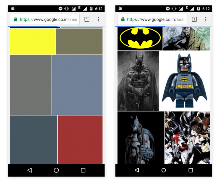
Progressive images loading displays as blurred low quality image that improves in resolution after the entire image is successfully fetched. This method is actively in popular apps like Medium.
Image supports progressive loading of images with the use help of the loaderType and previewSource props. The previewSource is usually a low resolution version of the desired source image.
// The loaderType prop specifies that this image needs to be loaded progressively<Image width={100} height={100} loaderType="progressive" source={{ uri: "https://www.pixel4k.com/wp-content/uploads/2020/08/the-valley-minimal-4k_1596932776.jpg", }} previewSource={{ uri: "<url-of-the-preview-image>", }}/>If you do not have a preview source image to work with, you can make use of the previewColor to emulate the progressive image loading behaviour used widely in Google Image Search as follows:

// The loaderType prop specifies that this image needs to be loaded progressively<Image width={100} height={100} loaderType="progressive" source={{ uri: "https://www.pixel4k.com/wp-content/uploads/2020/08/the-valley-minimal-4k_1596932776.jpg", }} previewColor="#934a9a"/>When both previewSource and previewColor props are specified, previewSource has a higher precedence.
Spinner loading#
You could also add a good ol' Spinner while the image is loading by setting the value of the loaderType props to
// The loaderType prop specifies that a spinner should be added while this image is being loaded<Image width={100} height={100} loaderType="spinner" source={{ uri: "https://www.pixel4k.com/wp-content/uploads/2020/08/the-valley-minimal-4k_1596932776.jpg", }}/>Image Fallback#
Sometimes, the image you want to display doesn't exist or cannot be accessed due to network issues. In these cases, it is a good practice to show a replacement to the user as a fallback.
This is possible with the use of the fallbackSource and fallbackComponent props.
// Displays an image saying 'No Image Available' in case the source image doesn't exist<Image  width={100}  height={100}  fallbackSource={{    uri: "https://cdn.segmentnext.com/wp-content/themes/segmentnext/images/no-image-available.jpg",  }}  source={{    uri: "https://4kwallpapers.com/imas/wallpapers/macos-big-sur-apple-layers-fluidic-colorful-wwdc-stock-2560x1440-1455.jpg",  }}/>;
// Displays a custom component with an error icon in case the source image doesn't existimport { Icon } from "pearl-ui";
<Image width={100} height={100} fallbackComponent={ <Icon iconFamily="MaterialIcons" iconName="error-outline" size="l" color="neutral.50" /> } source={{ uri: "https://4kwallpapers.com/imas/wallpapers/macos-big-sur-apple-layers-fluidic-colorful-wwdc-stock-2560x1440-1455.jpg", }}/>;If both the props are specified, the fallbackComponent prop takes higher precedence over fallbackSource.
Override Style#
The Image component also supports a variety of style props which can be used to override the pre-defined component style in the theme. Manual style props passed into the component have a higher precedance than the default component style.
<Image mt="xl" boxShadow="xl" borderRadius="m" width="50%" height={200} source={{ uri: "https://wallpaperaccess.com/full/1713248.jpg", }}/>Example#
Accessibility#
- Image has the
roleofimage.
Props#
Supported style props#
Image composes the Box component, you can pass all Box props to Image.
Additional props#
Image also composes the Image component from React Native, therefore all of it's props are supported in addition to the props given below:
| Name | Required | Type | Default | Description |
|---|---|---|---|---|
| size | false | Size of the image. | ||
| variant | false | Variant of the image. | ||
| isCached | false | true | Whether a remote image should be cached. | |
| loaderType | false | "spinner" | The type of loading to use until the image has loaded. | |
| previewSource | false | Source of the image to show while the remote image is being fetched. | ||
| previewColor | false | Color of the image container while the remote image is being fetched. | ||
| transitionDuration | false | 300 | Duration (in ms) it takes for progressive loading overlay to fade away after the image has loaded. | |
| imageDownloadOptions | false | {} | Download configuration when fetching the remote image. | |
| tint | false | "dark" | Tint of the progressive loading overlay. | |
| fallbackComponent | false | A custom component to show if an error occurs while loading the image. | ||
| fallbackSource | false | Source of the image to show if an error occurs while loading the image. |
Default component Style#
export default { parts: ["root", "spinner"], baseStyle: { root: { loaderType: "spinner", backgroundColor: "neutral.100", isCached: true, borderRadius: "l", transitionDuration: 300, tint: "dark", }, spinner: { color: "neutral.400", }, },};