Default Theme
The theme object is where you define your app's color palette, spacing scale, typography variants, border radius scales, and more.
It can also be used to create and manage style variants for any components created using Pearl UI.
Color palette#
The theme contains a theme.palette object for providing colors for your project. By default, these colors can be referenced by the color, borderColor, backgroundColor, shadowColor, and textShadowColor style properties.
We recommend adding a palette that ranges from 100 to 900. Tools like Themera, Smart Swatch, Coolors, Eva Color Generator or Palx can be used to generate these palettes. You can also use the generatePalette function included in the Pearl UI library.
// theme.jsexport default {  palette: {    primary: {      50: "#F0F2FF",      100: "#E1E6FF",      200: "#C3CCFF",      300: "#A5B1FF",      400: "#8F9DFF",      500: "#6A7BFF",      600: "#4D5BDB",      700: "#3541B7",      800: "#212A93",      900: "#141B7A",    },
secondary: { 50: "#FFF1F4", 100: "#FFE1E7", 200: "#FFC3D6", 300: "#FFA5CB", 400: "#FF8FC9", 500: "#FF6AC6", 600: "#DB4DB3", 700: "#B7359F", 800: "#93218A", 900: "#78147A", }, // ... },};Pearl UI provides a sensible default theme, but you can fully customize it to fit your design.
Primary#
Primary 50
#F0F2FF
Primary 100
#E1E6FF
Primary 200
#C3CCFF
Primary 300
#A5B1FF
Primary 400
#8F9DFF
Primary 500
#6A7BFF
Primary 600
#4D5BDB
Primary 700
#3541B7
Primary 800
#212A93
Primary 900
#141B7A
Secondary#
Secondary 50
#FFF1F4
Secondary 100
#FFE1E7
Secondary 200
#FFC3D6
Secondary 300
#FFA5CB
Secondary 400
#FF8FC9
Secondary 500
#FF6AC6
Secondary 600
#DB4DB3
Secondary 700
#B7359F
Secondary 800
#93218A
Secondary 900
#78147A
Neutrals#
Neutral 50
#FFFFFF
Neutral 100
#F7F9FC
Neutral 200
#EDF1F7
Neutral 300
#E4E9F2
Neutral 400
#C5CEE0
Neutral 500
#8F9BB3
Neutral 600
#58617A
Neutral 700
#2E3A59
Neutral 800
#222B45
Neutral 900
#1A2138
Alerts#
Success#
Success 50
#F6FBE6
Success 100
#F5FCCC
Success 200
#EAFA9A
Success 300
#D6F266
Success 400
#C0E640
Success 500
#A2D608
Success 600
#86B805
Success 700
#6C9A04
Success 800
#537C02
Success 900
#426601
Info#
Info 50
#ECFBFE
Info 100
#D8FEFB
Info 200
#B2FEFC
Info 300
#8CF6FC
Info 400
#6FE8FA
Info 500
#40D2F7
Info 600
#2EA6D4
Info 700
#207EB1
Info 800
#145B8F
Info 900
#0C4176
Warning#
Warning 50
#FFF9EB
Warning 100
#FFF7D6
Warning 200
#FFEDAE
Warning 300
#FFE085
Warning 400
#FFD367
Warning 500
#FFBF35
Warning 600
#DB9C26
Warning 700
#B77B1A
Warning 800
#935D10
Warning 900
#7A480A
Danger#
Danger 50
#FFEDEC
Danger 100
#FFE7D9
Danger 200
#FFCAB3
Danger 300
#FFA68D
Danger 400
#FF8371
Danger 500
#FF4B42
Danger 600
#DB3036
Danger 700
#B72133
Danger 800
#93152E
Danger 900
#7A0C2C
Named Colors#
Pearl UI supports the following CSS named colors by adding them to the default theme palette:
{ "transparent": "transparent", "aliceblue": "#f0f8ff", "antiquewhite": "#faebd7", "cyan": "#00ffff", "aquamarine": "#7fffd4", "azure": "#f0ffff", "beige": "#f5f5dc", "bisque": "#ffe4c4", "black": "#000000", "blanchedalmond": "#ffebcd", "blue": "#0000ff", "blueviolet": "#8a2be2", "brown": "#a52a2a", "burlywood": "#deb887", "cadetblue": "#5f9ea0", "chartreuse": "#7fff00", "chocolate": "#d2691e", "coral": "#ff7f50", "cornflowerblue": "#6495ed", "cornsilk": "#fff8dc", "crimson": "#dc143c", "darkblue": "#00008b", "darkcyan": "#008b8b", "darkgoldenrod": "#b8860b", "darkgray": "#a9a9a9", "darkgreen": "#006400", "darkkhaki": "#bdb76b", "darkmagenta": "#8b008b", "darkolivegreen": "#556b2f", "darkorange": "#ff8c00", "darkorchid": "#9932cc", "darkred": "#8b0000", "darksalmon": "#e9967a", "darkseagreen": "#8fbc8f", "darkslateblue": "#483d8b", "darkslategray": "#2f4f4f", "darkturquoise": "#00ced1", "darkviolet": "#9400d3", "deeppink": "#ff1493", "deepskyblue": "#00bfff", "dimgray": "#696969", "dodgerblue": "#1e90ff", "firebrick": "#b22222", "floralwhite": "#fffaf0", "forestgreen": "#228b22", "fuchsia": "#ff00ff", "gainsboro": "#dcdcdc", "ghostwhite": "#f8f8ff", "goldenrod": "#daa520", "gold": "#ffd700", "gray": "#808080", "green": "#008000", "greenyellow": "#adff2f", "honeydew": "#f0fff0", "hotpink": "#ff69b4", "indianred": "#cd5c5c", "indigo": "#4b0082", "ivory": "#fffff0", "khaki": "#f0e68c", "lavenderblush": "#fff0f5", "lavender": "#e6e6fa", "lawngreen": "#7cfc00", "lemonchiffon": "#fffacd", "lightblue": "#add8e6", "lightcoral": "#f08080", "lightcyan": "#e0ffff", "lightgoldenrodyellow": "#fafad2", "lightgreen": "#90ee90", "lightgrey": "#d3d3d3", "lightpink": "#ffb6c1", "lightsalmon": "#ffa07a", "lightseagreen": "#20b2aa", "lightskyblue": "#87cefa", "lightslategray": "#778899", "lightsteelblue": "#b0c4de", "lightyellow": "#ffffe0", "lime": "#00ff00", "limegreen": "#32cd32", "linen": "#faf0e6", "magenta": "#ff00ff", "maroon": "#800000", "mediumaquamarine": "#66cdaa", "mediumblue": "#0000cd", "mediumorchid": "#ba55d3", "mediumpurple": "#9370db", "mediumseagreen": "#3cb371", "mediumslateblue": "#7b68ee", "mediumspringgreen": "#00fa9a", "mediumturquoise": "#48d1cc", "mediumvioletred": "#c71585", "midnightblue": "#191970", "mintcream": "#f5fffa", "mistyrose": "#ffe4e1", "moccasin": "#ffe4b5", "navajowhite": "#ffdead", "navy": "#000080", "oldlace": "#fdf5e6", "olive": "#808000", "olivedrab": "#6b8e23", "orange": "#ffa500", "orangered": "#ff4500", "orchid": "#da70d6", "palegoldenrod": "#eee8aa", "palegreen": "#98fb98", "paleturquoise": "#afeeee", "palevioletred": "#db7093", "papayawhip": "#ffefd5", "peachpuff": "#ffdab9", "peru": "#cd853f", "pink": "#ffc0cb", "plum": "#dda0dd", "powderblue": "#b0e0e6", "purple": "#800080", "rebeccapurple": "#663399", "red": "#ff0000", "rosybrown": "#bc8f8f", "royalblue": "#4169e1", "saddlebrown": "#8b4513", "salmon": "#fa8072", "sandybrown": "#f4a460", "seagreen": "#2e8b57", "seashell": "#fff5ee", "sienna": "#a0522d", "silver": "#c0c0c0", "skyblue": "#87ceeb", "slateblue": "#6a5acd", "slategray": "#708090", "snow": "#fffafa", "springgreen": "#00ff7f", "steelblue": "#4682b4", "tan": "#d2b48c", "teal": "#008080", "thistle": "#d8bfd8", "tomato": "#ff6347", "turquoise": "#40e0d0", "violet": "#ee82ee", "wheat": "#f5deb3", "white": "#ffffff", "whitesmoke": "#f5f5f5", "yellow": "#ffff00", "yellowgreen": "#9acd32"}Typography#
The typography system for the theme is created by setting the Component Style Config of Text. Pearl UI uses Poppins as the default theme font and provides the following text variants:
Headers and Titles#
Heading 1
Heading 2
Title 1
Title 2
Subtitle 1
Subtitle 2
Paragraph#
Paragraph - Regular
Paragraph - Small
Button#
Button - Large
Button - Regular
Button - Small
Button - Tiny
Others#
Caption
Spacing#
The theme contains a theme.spacing object which controls the spacing system. By default, these colors can be referenced by the padding, and margin style properties.
We adopt a t-shirt size naming convention for our sizing system, but you can customize it to whatever fits your fancy.
// theme.jsexport default { spacing: { hairline: 2, xs: 4, s: 8, m: 16, l: 24, xl: 32, "2xl": 40, "3xl": 48, "4xl": 56, "5xl": 64, "6xl": 72, "7xl": 80, "8xl": 88, "9xl": 96, },};| Name | Space | |
|---|---|---|
hairline | 2 | |
xxs | 4 | |
xs | 8 | |
s | 12 | |
m | 16 | |
l | 24 | |
xl | 32 | |
2xl | 40 | |
3xl | 48 | |
4xl | 56 | |
5xl | 64 | |
6xl | 72 | |
7xl | 80 | |
8xl | 88 | |
9xl | 96 |
Border Radius#
The theme contains a theme.borderRadii object which controls the system for border radii. By default, these colors can be referenced by the borderRadius style properties.
We adopt a t-shirt size naming convention here as well.
// theme.jsexport default { borderRadii: { xs: 2, s: 4, m: 8, l: 16, xl: 24, "2xl": 32, full: 1000, },};Shadow/Elevation#
The theme contains a theme.elevation object which controls the shadow/elevation system. By default, these colors can be referenced by the boxShadow style properties.
We adopt a t-shirt size naming convention here as well.
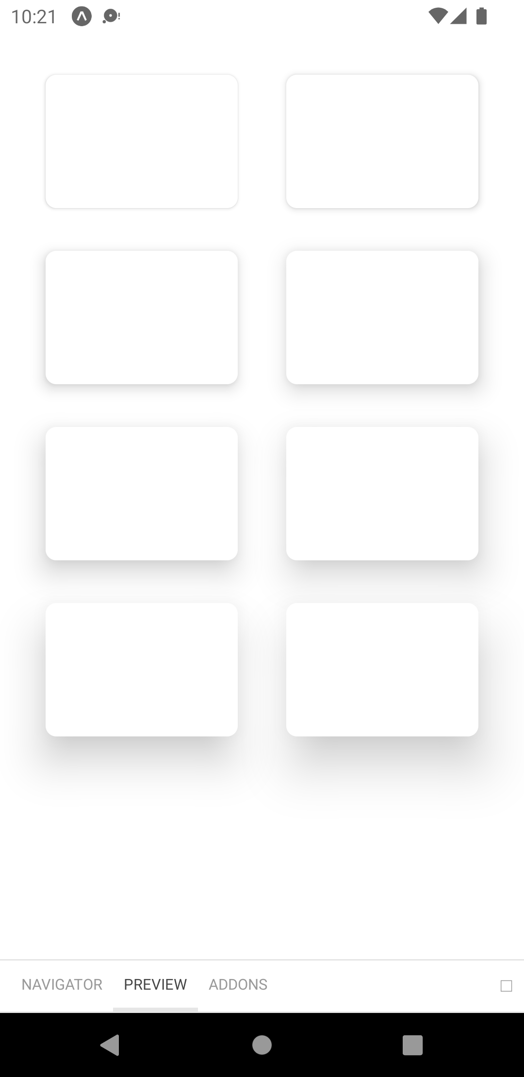
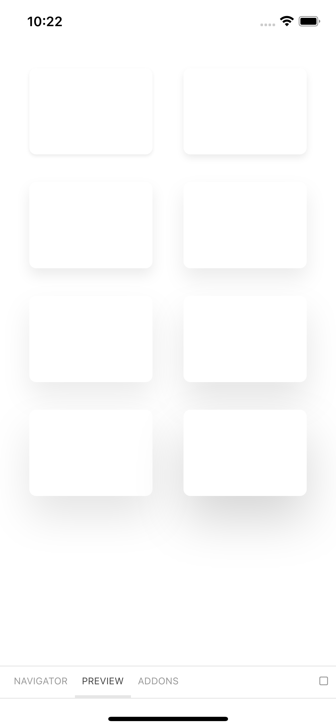
// theme.jsexport default { elevation: { xs: { shadowColor: "#1A2138", shadowOffset: { width: 0, height: 2, }, shadowOpacity: 0.08, shadowRadius: 2, elevation: 2, }, s: { shadowColor: "#1A2138", shadowOffset: { width: 0, height: 4, }, shadowOpacity: 0.08, shadowRadius: 4, elevation: 4, }, m: { shadowColor: "#1A2138", shadowOffset: { width: 0, height: 8, }, shadowOpacity: 0.08, shadowRadius: 8, elevation: 8, }, l: { shadowColor: "#1A2138", shadowOffset: { width: 0, height: 12, }, shadowOpacity: 0.08, shadowRadius: 12, elevation: 12, }, xl: { shadowColor: "#1A2138", shadowOffset: { width: 0, height: 16, }, shadowOpacity: 0.08, shadowRadius: 16, elevation: 16, }, "2xl": { shadowColor: "#1A2138", shadowOffset: { width: 0, height: 20, }, shadowOpacity: 0.1, shadowRadius: 20, elevation: 20, }, "3xl": { shadowColor: "#1A2138", shadowOffset: { width: 0, height: 24, }, shadowOpacity: 0.1, shadowRadius: 24, elevation: 24, }, "4xl": { shadowColor: "#1A2138", shadowOffset: { width: 0, height: 28, }, shadowOpacity: 0.16, shadowRadius: 28, elevation: 28, }, },};info
The box shadows look slightly different between Android and iOS (They look more saturated on Android as shown below). This is due to the limitations of the Android Elevation API.
z-index values#
The theme contains a theme.zIndices object that provides pre-defined z-index values (inspired from Chakra UI). These values can help you control the stacking order of components and solve stacking issues very efficiently.
// theme.jsexport default { zIndices: { hide: -1, auto: "auto", base: 0, docked: 10, dropdown: 1000, sticky: 1100, banner: 1200, overlay: 1300, modal: 1400, popover: 1500, skipLink: 1600, toast: 1700, tooltip: 1800, },};